
2023 “Nomad Relays” New Trends Unit | Tengis

Notes on
the guest
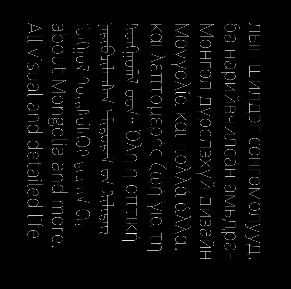
Throughout history, the Mongols produced and used numerous scripts. The first Mongolian script, known as Uyghurjin bichig, was created in 1204 by Tata-tonga at the order of Temujin, and Mongols have been using it since Temujin was proclaimed Chinggis Khan in 1206 when the Mongol state (Mongol Uls) was established. In 1269, Kublai Khan issued the "New Mongolian Script", a script devised by the State Preceptor,Phagspa, based on the Tibetan alphabets, and is therefore also known as ’Phags-pa script or dörvöljin bichig (square script) in Mongolian. However, the predilection of the Mongols for the Uyghur Mongolian script limited its use to official documents and the transcription of other languages. In 1648 the eminent monk Zaya Pandita (Namkhaijamts) of the Hoshuut Khanate of the Oirats created yet another script – Todo bichig – which means "clear script", in an effort to improve the Uyghur Mongolian script. Since 1946, Mongolia has been using a phonetic script based on the Cyrillic alphabet, known as Kiril bichig in Mongolian. On the other hand, the Inner Mongolian Autonomous Region of the People's Republic of China still use the Uyghur Mongolian script.
When the Mongols adopted Tibetan Buddhism and translated Buddhist scriptures extensively in the sixteenth century, they began to create alternative alphabets to reflect Tibetan and Sanskrit sounds. To facilitate the transcription and recording of the Tibetan scriptures, the Kharachin Mongolian translator Ayush Gush modified the old script and created a new script, Ali-Gali, in 1587. In 1686, Zanabazar, the supreme Buddhist leader of the Khalkha Mongols, invented the Soyombo script to write Mongolian, as well as to transcribe Tibetan and Sanskrit, but its complexity precluded its use in daily life. 1905 saw the creation of the Vagindra script by the Buryat lama Agvan Dorji (Dorzhiev). This script primarily reflects the Buryat dialect and was used in the religious context. The outbreak of the First World War, however, halted its spread.
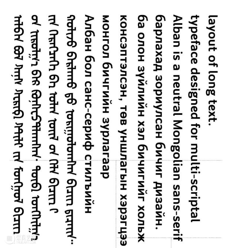
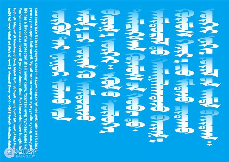
The Uyghur Mongolian script has the longest history of all the Mongolian scripts and is the only vertically written script that is still widely used around the world. However, its vertical, top-to-bottom, and left-to-right reading style complicates the design of its typeface. Tengis Khasbagana, hailing from Inner Mongolia, is a typeface designer for the Uyghur Mongolian script. He has designed a number of Mongolian typefaces, including Amidu and Alban, and the Mongolian logo he designed for Starbucks Coffee has attracted considerable public attention.
Notes on the guest
(interview video )
Why is it necessary to design typeface?
When we read, we are actually glancing at the outline of a word, not the individual letters. Long-term practise has enabled us to recognise the outline of a word merely by glancing at it, and we can quickly comprehend its meaning. Therefore, we are creating the outline of a word, and that is precisely what these designers are doing. It is similar to being the conductor of a symphony in that all of these positions must be in the proper location. Therefore, a high-quality typeface will be particularly effective at organising these.
What are the fundamental requirements for designing typefaces?
How readable is the typeface? This is a component of what is known in typography as legibility. Readability and accessibility are its two characteristics. Mongolian typefaces have not evolved stylistically from ancient times to the present; therefore when a more contemporary style is created, the reader may find it unfamiliar and unsettling. Therefore, the designer must bring it under control; excessive aggression is unacceptable, and excessive conservatism is not an improvement, either. Therefore, multiple trial-and-error attempts are necessary.

Does the design of a typeface for the Mongolian script differ from that of other languages?
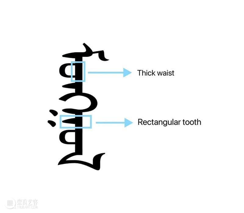
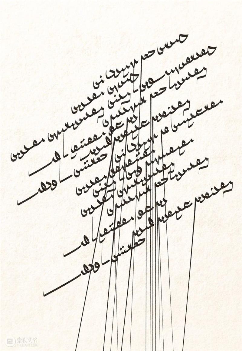
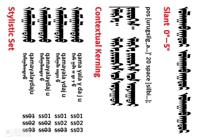
What is the primary distinction between the Mongolian script and other writing systems? It is the point of balance. I don't know if you've seen a picture of a beautiful woman inverted on the internet. At first glance we see nothing wrong with it, but after turning the image upside down, it becomes apparent that her eyes are positioned invertedly. Because of this, the perspective we have on things is particularly important. There is nothing like this in other languages. Once a language is written vertically, it is especially afraid of being stretched by gravitational force; therefore, we must make the script a little stronger, or more compact. It is either bending or leaning back. You must pick up one. I believe that this occurs less frequently in other scripts, though it is possible that it may be present. In some fonts, the lowercase "a," particularly the double lowercase "a," leans forward, whereas in others, the "a" has a larger opening, that is, it is thicker. It is difficult to control the point of balance, and it also interferes with the rhythms of other letters. In Mongolian, for instance, the waist is thick, and the letters we used to study all had thick waists and triangular teeth. Therefore, the Mongolian sans serif must inherit some of this feeling by making the waist wider a bit. However, this is contrary to the Latin script.
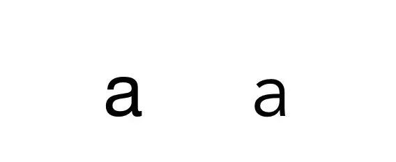
(Two typeface designs with different points of balance)
(The regular Mongolian typeface)
What was it like to discover that foreigners were designing Mongolian font?
The Japanese were the pioneers in this endeavour. This may be one of their characteristics, namely that they are not native speakers but still have the courage to design fonts for the scripts of other nations. They have such self-confidence. The second characteristic, which is also one of their most prominent entry points, is that they study how to write, discover a particular logic in the act of writing, and transform it into a design logic. Their typefaces have a strong humanistic quality as a result. In other words, the writing style more accurately reflects the rhythm of the handwriting. It is similar to our Hawang style, but not identical. From a western perspective, it is a type of brush paste or brush type.
(Mongolian font Marco designed by Japanese type designer Toshi Omagari)
What are the features of the Mongolian fonts you have created?
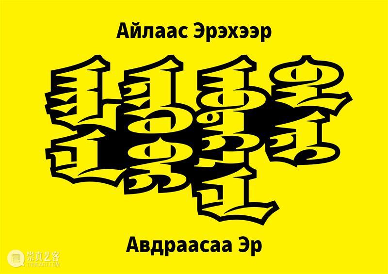
The font Amidu is a sans serif typeface with curved waistline. The Mongolian script can have a straight waistline like this, but this font is curved. For instance, when you write a belly, it is curved like this, and when you write a long tooth, it is also curved when it returns. It has a more humanistic appearance when curved. Using this rhythm in a sans serif font, it somewhat imitates the rhythm of handwriting. However, this is where the difficulty lies, as joining the two bends presents numerous challenges. Alban is the default font, the font that comes to mind when people think of bold type, as it should. I wanted to create such a font, so I’ve named it Alban, and it consists of only two types: regular and bold. The font I've just completed has finer details. This is an enhanced form of Alban.
(Amidu font)
(Alban font)
Is there anything else that type designers desire besides creativity?
There is no real creative inspiration; just bite the bullet and do it. I simply continue doing it and revising it as I go, and I may or may not get better over time. If you get better, you're lucky. You are fortunate if there is progress. Then, a pattern emerges from the process, and identifying that pattern is probably more accurate than drawing inspiration from something. The typography is available in a variety of sizes, ranging from a hair-thin version to an extremely thick version. I occasionally have dreams about it, especially when the workload is heavy. In my dreams, I am constantly doing things with the mouse, using the data of its anchor points, and so on.
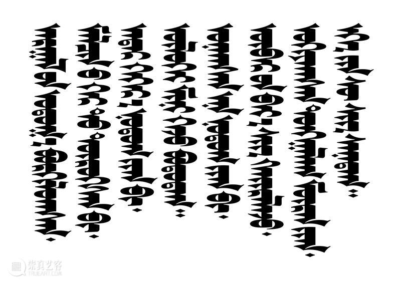
(The Mongolian font designed by Tengis for the Hanggai band's album)
Why are there so few Mongolian font designers?
First, fonts are unobtrusive, and users are typically unaware that they have been created. People erroneously believe that the Chinese font is an integral part of the computer. Passionate designers are uninterested in such inconspicuous things. As for the Mongolian typeface, there is no place where it can be studied systematically, which is a hindrance. Moreover, what we are doing is transforming the western font design concept into our own design; the result must be effective. It is a gamble as to whether or not it will work, which is an additional obstacle. There are numerous obstacles, and the bar remains relatively high at the operational level. There is a great deal of uncertainty and a large amount of historical legacy left by the older computers we once used. For instance, Chinese characters used to be drawn in a 1000 x 1000 square grid, and there was a format called 2048, or you could simply set a format however you like. These things baffle contemporary designers.
Our Mongolian language has similar historical legacies which have resulted in some peculiarities, such as the requirement to place a special space before postpositional prepositions such as "in", "un", and "u" to ensure that "in" is the long-toothed "in" and "un" is uncrowned. This is another relic of the period. But today we have a different definition of the space which can stay on the previous line. For instance, if you leave "mongol un" on the previous line in order to reduce the size of the text box, you must also leave the space on the same line. If the space is converted into a line break, the following "un" is not guaranteed to morph correctly; it acquires the crown, its pronunciation becomes "on," and its meaning becomes "year." Technical standards were not the same as they are today.
You have stated in the past that you are neither a designer nor an artist. Why?
I see myself as a champion of the (Mongolian) language. Language is one of the most vital nutrients (for social life). Until the language is developed, other topics, including design, competition, and commercialization, cannot be discussed. You must have a solid grasp of the language before you can do anything else.

How would you describe the nomadic lifestyle?
In my current state of mind, the nomadic culture is exemplified by the Mongolian expression ül toomsorloh, which translates to a lack of concern regarding numerous matters. Being unconcerned about a sandstorm or a natural disaster, for instance, is a sign of strength and resiliency. Today, the language environment is tightening, and people are particularly vulnerable, so this attitude of nonchalance is also indicative of a state of resilience. This is nomadic living, and nomads are not snowflakes. This, I believe, is an innate understanding of nomadism. Nomadic culture is not just about moving to wherever water and grass are available, nor is it restricted to a single mode of production. I believe this is a more intriguing point.
This interview/Shooting/post/tweet: Erilchin Studio
Translator: Binyu Cao
Proofreader: Ran Yang


已展示全部
{{item.publisher_name}} 发布了 文章
{{item.title}}
更多功能等你开启...

 分享
分享