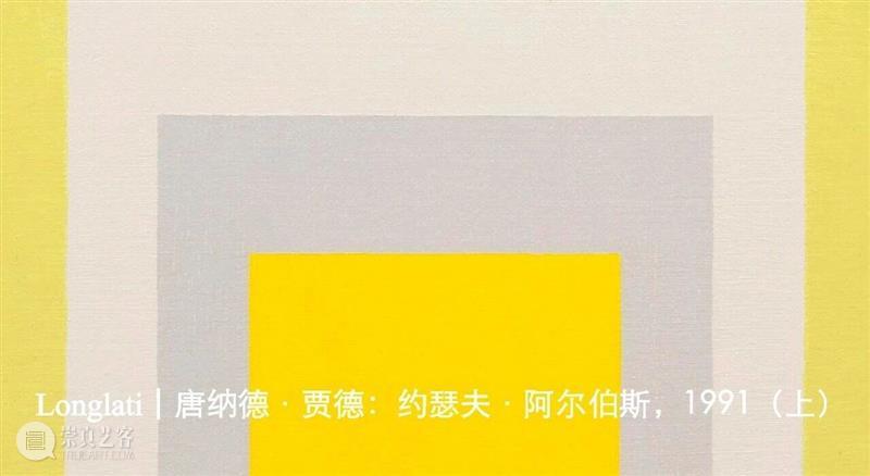
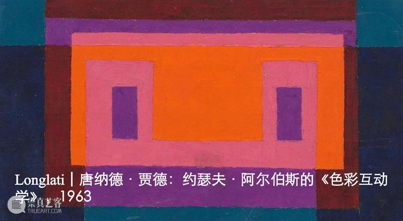
Longlati | 约瑟夫·阿尔伯斯:《色彩互动学》(ARTnews专稿,1963)
![]() {{newsData.publisher_name}}
{{newsData.update_time}}
浏览:{{newsData.view_count}}
来源 | {{newsData.source}} 作者 | {{newsData.author}}
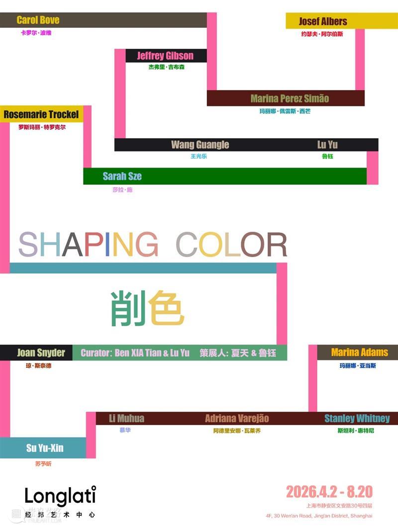
Shaping Color
展期 Dates
2026.04.02–2026.08.20
策展人 夏天
Curated by Ben XIA Tian
艺术家、联合策划: 鲁钰
Artist and Curatorial Collaborator: Lu Yu
INTERACTION OF COLOR BY JOSEF ALBERS
SPECIAL ARTICLE FOR ARTNEWS作者:约瑟夫·阿尔伯斯 原文自,ARTnews, Volume 62, Number 1 March 1963本月,贾尼斯画廊(Janis Gallery)以一场大型个展庆祝约瑟夫·阿尔伯斯的七十五岁生日;与此同时,他那部卷帙浩繁的色彩著作也告出版。该书回顾其方法,并阐明这位杰出艺术家及教师的哲学。阿尔伯斯是一位严厉的导师,以纪律来创造自由;其观察使他将高度文明化的趣味与深邃的神秘感调和起来。他继续以明亮的色彩绘制方形系列,这些作品是现代艺术的荣耀之一。他特意为本期《ARTnews》封面设计了一组六幅作品。以下内容节选自其著作《色彩互动学》(耶鲁大学出版社,定价200美元),并附一张首次发表的彩色图版。
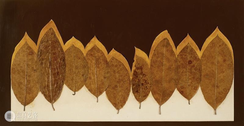
Josef Albers, Leaf Study I, ca. 1940, leaves, coloured paper, and adhesive, 24.1 × 45.7 cm. Images courtesy of Josef & Anni Albers Foundation 约瑟夫·阿尔伯斯,《树叶研究 I》,约1940年,树叶、彩色纸、黏合剂,24.1 × 45.7厘米。作品图片来源于Josef & Anni Albers Foundation
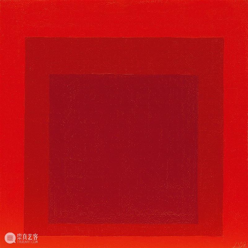
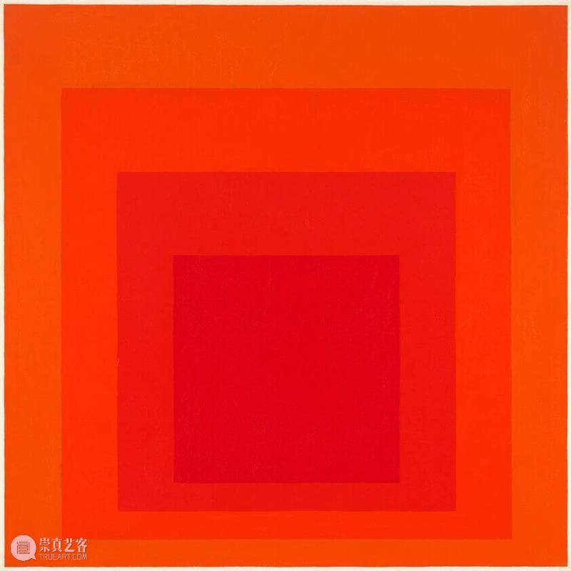
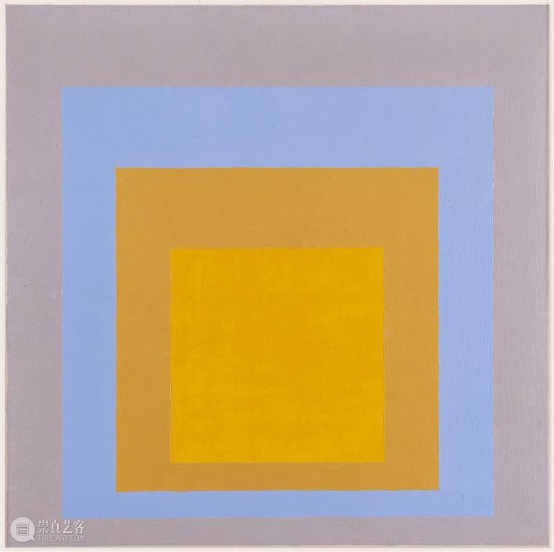
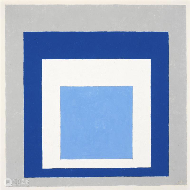
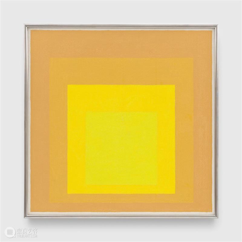
在视觉上,一种颜色几乎从不会以其真实面貌即物理属性被看见。正因如此,色彩成为艺术表现中最具相对性的媒介。若要有效地运用色彩,必须认识到色彩无时无刻不在欺骗我们。因此,起点并非研究色彩体系。实践练习通过色彩欺骗(错觉)展示色彩的相对性和不稳定性。而经验则告诉我们:在视觉感知中,物理事实与心理效应之间存在差异。在这里,自始至终真正重要的都不是所谓关于“事实”(fact)的知识,而是视觉(vision),即“看见”(seeing)。这里所说的“看见”包含德语Schauen(如同Weltanschauung,即“世界观”),之意,它与幻想和想象相连。这种研究路径将引导我们从对色彩相互作用的直接视觉体验出发,逐步意识到色彩并非孤立存在,而是始终与形式和空间位置相互关联;与数量因素(如面积、范围、数目及其重复出现)相互制约;与色彩的性质(如明度和色相)相互影响;以及与显著程度(由边界的分离或连接形成)相互依存。假如说出“红色”这一色彩名称时,旁边有五十位听众,那么他们心中所浮现的很可能是五十种不同的红色。并且可以确信,这些红色意象彼此之间都不同。Josef Albers, Homage to the Square, 1969, oil on Masonite, 40.4 × 40.3 × 0.4 cm. Image courtesy of Josef and Anni Albers Foundation / Artists Rights Society (ARS), New York 约瑟夫·阿尔伯斯,《向方形致敬》,1969年,油彩、梅松板,40.4 × 40.3 × 0.4厘米。作品图片来源于Josef and Anni Albers Foundation / Artists Rights Society (ARS), New York
Josef Albers, Homage to the Square: "Wait", 1967, oil on composition board, 121.6 × 121.6 cm. Image courtesy of The Whitney Museum of American Art / The Josef and Anni Albers Foundation / Artists Rights Society (ARS), New York 约瑟夫·阿尔伯斯,《向方形致敬:等待》,1967年,油彩、复合板,121.6 × 121.6厘米。作品图片来源于惠特尼美国艺术博物馆 / The Josef and Anni Albers Foundation / Artists Rights Society (ARS), New York
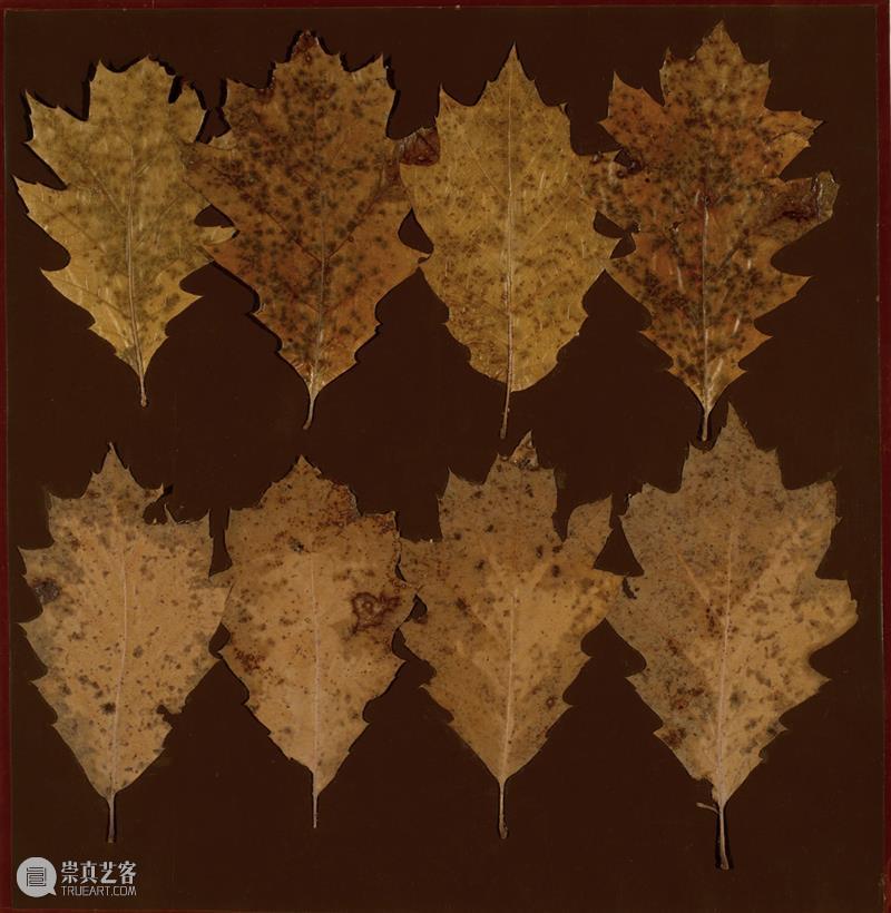
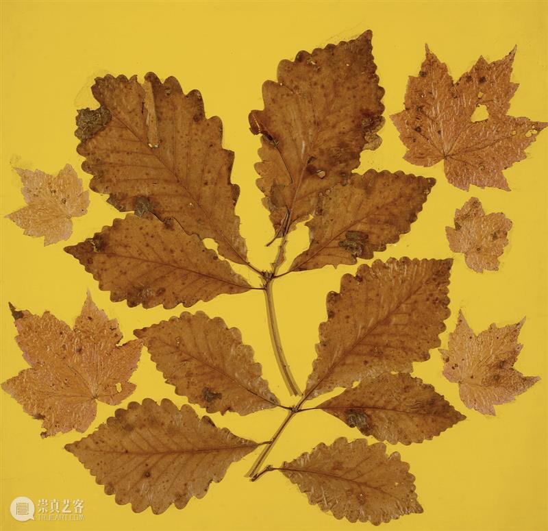
即使指定一种极为明确且反复出现的颜色——可口可乐商标上使用的红色(这种红色在全国范围内是统一的)——他们心中所想到的依然是各式各样的红。就算把数百种红色摆在所有听众面前,让他们从中选出可口可乐红,他们还是会选出截然不同的颜色。而且,谁也无法确信自己找到了完全准确的那个红色。甚至,当我们把中间有白色Coca-Cola字样的圆形可口可乐红色标志展示给每个人看,让每个人都注视同一种红色,所有人的视网膜虽会接收到同样的投影,谁也无法确定他们是否具有同样的感知。“树叶研究——一项美国研究”(Leaf studies-an American discovery),阿尔伯斯对一种极富诗意的色彩探索的称呼:秋叶那多变的色相构成了一套天然的调色板。将树叶置于不同颜色的背景之上,观察研究其强度和分布所产生的多种效果。与阿尔伯斯的所有方法一样,这种高度系统化的探索旨在解放洞察力。
Josef Albers, Leaf Study VII, ca. 1942, leaves, coloured paper, and adhesive, 62.9 × 47 cm. Images courtesy of Josef & Anni Albers Foundation 约瑟夫·阿尔伯斯,《树叶研究 VII》,约1942年,树叶、彩色纸、黏合剂,62.9 × 47厘米。作品图片来源于Josef & Anni Albers FoundationJosef Albers, Leaf Study III, ca. 1940, leaves, coloured paper, and adhesive, 68.6 × 72 cm. Images courtesy of Josef & Anni Albers Foundation 约瑟夫·阿尔伯斯,《树叶研究 III》,约1940年,树叶、彩色纸、黏合剂,68.6 × 72 厘米。作品图片来源于Josef & Anni Albers Foundation首先,要清晰地记住确切的颜色非常困难,甚至不可能。这凸显了一个重要事实:与我们的听觉记忆相比,视觉记忆非常薄弱。听觉往往能够复现仅听过一两次的旋律。其次,颜色的命名体系极不完善。尽管现实存在有无数种颜色——深浅与色调——但在日常语汇中颜色名称却仅有约三十个。我们能够听到一个单独的音符。然而,在没有特殊装置的情况下,我们几乎从来看不到一种与其他颜色毫无联系、毫无关系的单一颜色。颜色总在连续的流变中呈现,并不断与变化中的相邻颜色和条件发生关系。因此,康定斯基对艺术理解经常提出的要求,同样适用于色彩的解读:重要的不是“是什么”(what),而是“是如何”(how)。
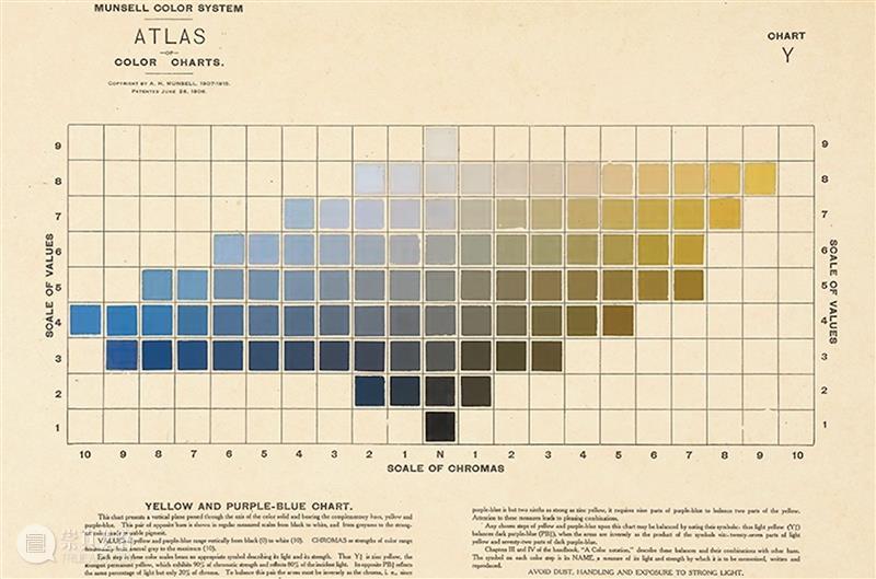
我们会发现,有些颜色很难发生变化,另一些颜色则更容易改变。我们试图找出哪些颜色更倾向于施加影响,并将它们同那些容易接受影响的颜色区分开来。色彩相互影响主要表现为两种机制:一种是明度(light),一种是色相(hue)。两者同时发生,只是强弱不一。Albert H. Munsell, Munsell’s Colour System, colour chart 阿尔伯特·H·孟塞尔,《孟塞尔色彩系统》,色彩图表
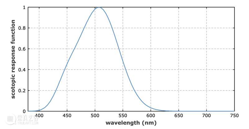
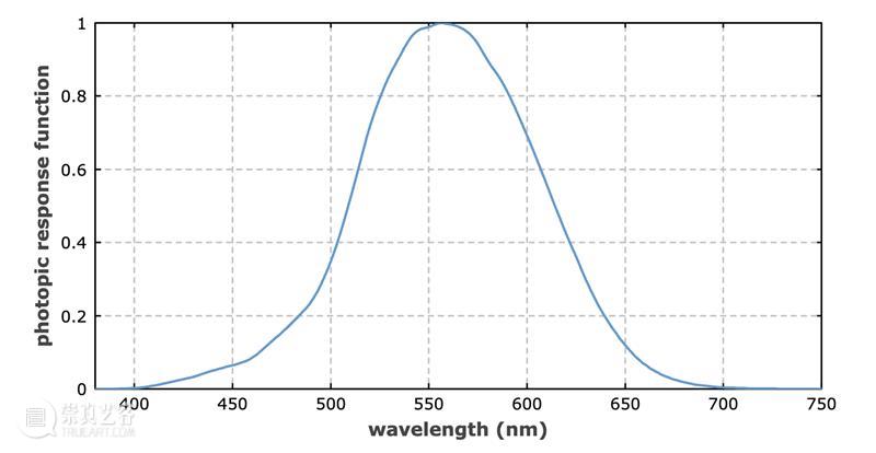
自摄影术发明以来,尤其是照相机械复制工艺发展以后,我们每天能够越来越多地接触到来自全球各地的图像——关于已见与未见、可见与不可见的世界。这些图像绝大多数是“黑白”的,仅以黑色油墨印在白色底面上。然而在视觉上,它们由黑白两极之间层次极其细密的各种灰调构成;这些灰调以不同程度彼此渗透。随着报纸、杂志和书籍所提供的图像信息急剧增长,我们获得了一种前所未有的对灰调明暗层次(从浅到深)的辨识训练。随着人们对彩色摄影和彩色复制的兴趣不断增加,一种与之平行的色彩明暗辨识训练也正在形成。通常,黑白摄影会把所有亮部记录得比调节能力更强的人眼所感知的更亮,把所有暗部记录得更暗。人眼还能辨别所谓的中间灰调,而在摄影图像中,这些灰阶往往会被压平,甚至丢失。相较于照片,人眼最大的优势在于,除“明视觉”(photopic seeing)之外,它还具有“暗视觉”(scotopic seeing)。这里所说的暗视觉,简言之,是视网膜对低照度条件的适应。The scotopic response function according to CIE (1951). Data source: Colour & Vision Research Laboratory of the University College London, page on luminous efficiency functions 依据 CIE(1951)的暗视觉响应函数,数据来源于伦敦大学学院色彩与视觉研究实验室(Colour & Vision Research Laboratory)“发光效率函数”页面The photopic response function according to CIE. Data source: Colour & Vision Research Laboratory of the University College London, page on luminous efficiency functions 依据 CIE 的明视觉响应函数,数据来源于伦敦大学学院色彩与视觉研究实验室(Colour & Vision Research Laboratory)“发光效率函数”页面彩色摄影比黑白摄影更加偏离人眼的视觉。蓝色和红色被过度强化,其明亮程度因而遭到夸大。这或许会迎合大众趣味,代价却是细微层次和精妙关系的丧失。白色很少呈现为白色,通常显得偏绿。这使蒙德里安绘画的彩色幻灯片变得令人难以忍受。
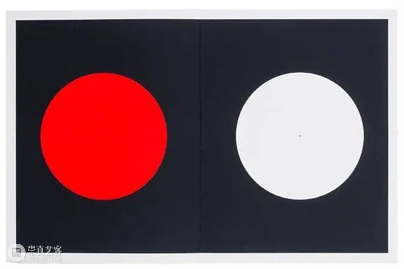
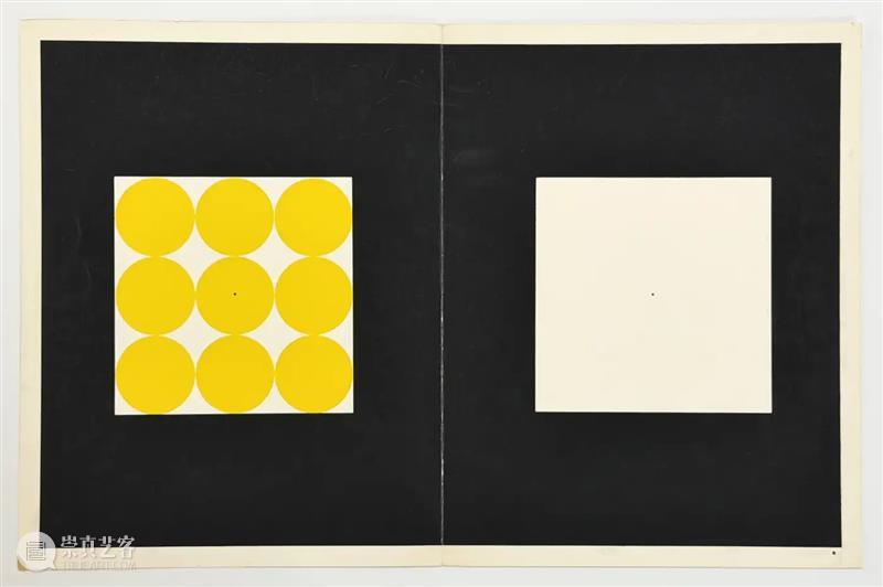
如俗语所说“绅士偏爱金发女郎”,人们总是对某些颜色怀有偏好,而对另一些颜色抱有成见。色彩组合亦然。人们趣味各异,似乎是一件好事。我们在日常生活中如何看待人,也会如何看待颜色。我们会改变、修正,乃至逆转自己对颜色的判断,而这种判断还可能来回摆动。因此,我们需要审视自己的色彩偏好与排斥:哪些颜色反复出现在我们的创作中占据主导位置;哪些颜色被排斥、嫌弃,或始终无法引起我们的兴趣。然而,经验表明,只要刻意尝试使用那些自己不喜欢的颜色,结果往往会由抗拒转变为喜爱。示例:左边是一个红色圆形,右边是一个白色圆形,两者大小相同,且在黑色背景上的位置相近。持续凝视红色圆形的中心标记点(至少一分钟),很快便会发现,要让眼睛固定在一点上十分困难。过一会儿,眼前会浮现弯月形状,沿着圆圈边缘移动。尽管如此,你仍必须继续注视红色中心点,以确保获得预期的体验。突然把视线转向白色圆形的中心。此时课堂上通常会响起表示惊讶或诧异的声音,因为所有视力正常的人都会突然看见绿色或蓝绿色,而非白色。这种绿色是红色或红橙色的互补色。此案例中,看到绿色而非白色的现象,我们称之为后像(after-image)或同时对比(simultaneous contrast)。Josef Albers, Interaction of Color (Die Wechselbeziehung der Farbe), 1973. Images courtesyJosef & Anni Albers Foundation 约瑟夫·阿尔伯斯,《色彩互动学(Die Wechselbeziehung der Farbe)》,1973年。作品图片来源于Josef & Anni Albers Foundation示例:左边是大小相同、彼此相切并填满一个白色正方形的橙色圆形;右边是一个同样大小的空白正方形。同样,两者都置于黑色背景之上。长时间凝视左侧正方形后,再突然将视线转向右侧白色正方形。这时,我们会体验到一种与前例截然不同的后像。看到的不是橙色圆形的互补色(蓝色),而是橙色的菱形(即圆圈之间空隙的形状)。这种错觉是一种“双重反转的后像”(double reversed after-image),有时也称“对比反转”(contrast reversal)。
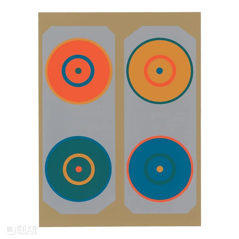
Josef Albers, Interaction of Color – serigraph, 1963 约瑟夫·阿尔伯斯,《色彩互动学——丝网版画》,1963年
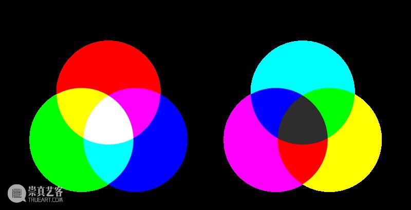
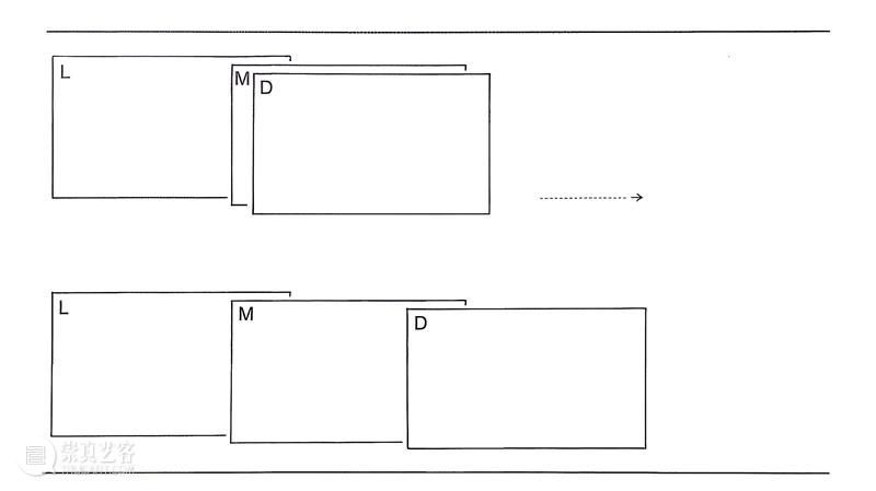
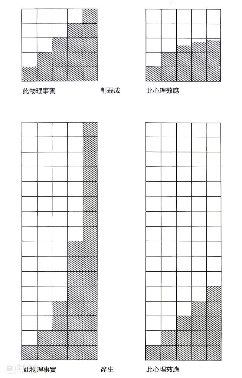
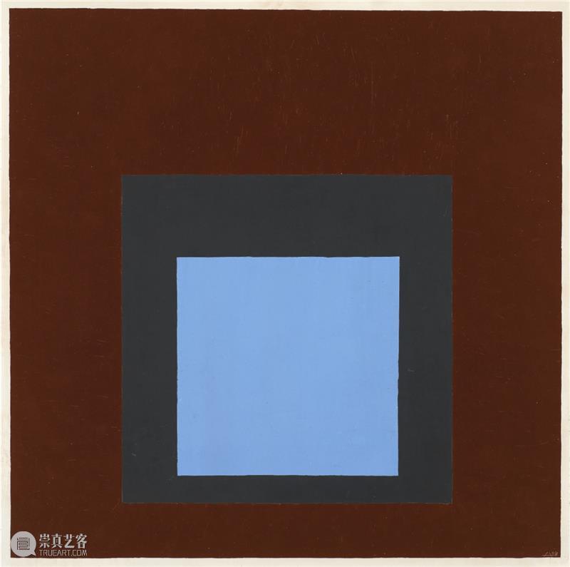
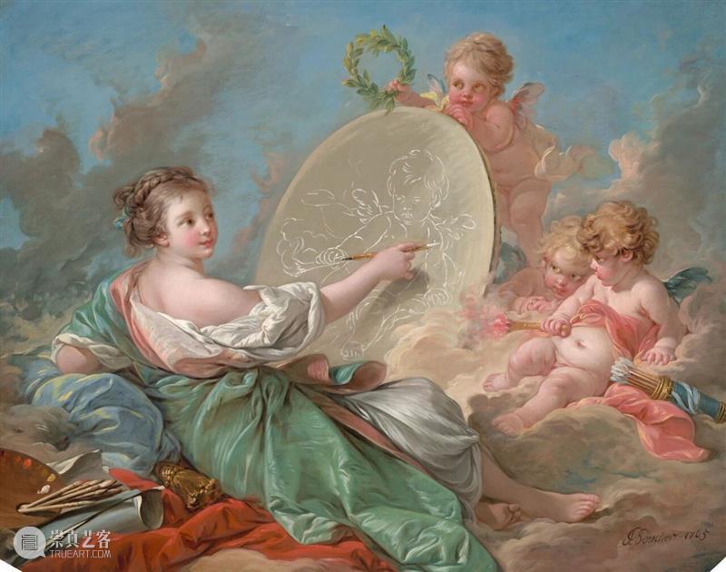
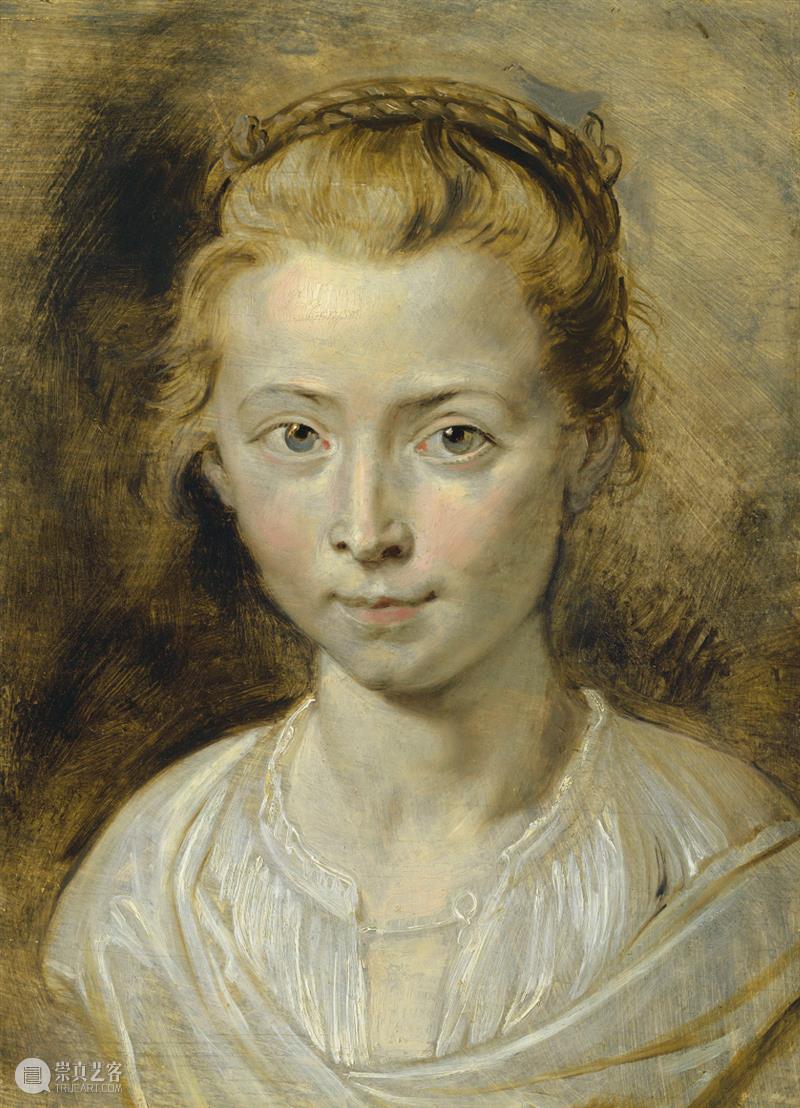
有一理论主张,人类视网膜上的神经末梢(视杆细胞和视锥细胞)会接收到三种基本颜色中的任意一种——构成全部色彩的红、黄、蓝三原色。长时间凝视红色会使视网膜中对红色敏感的部分产生疲劳,因此,当视线突然转向白色区域时(白的同样是由红、黄、蓝三色组成),眼睛看到的是黄色和蓝色的混合色:绿色——即红色的互补色。后像或同时对比是一种心理结合生理的现象,这一事实足以证明:任何一双正常的眼睛,即使受过最专业的训练,也无法完全避免色彩造成的欺骗。那些声称自己能不受错觉变化影响而看到颜色真实面貌的人,只能是自欺欺人,骗不了别人。Additive and subtractive colour primaries. Image attribution: “Additive and Subtractive Colour Primaries” by Lisa Cianci 加色混合与减色混合的三原色。图片来源:Lisa Cianci,《Additive and Subtractive Colour Primaries》a)色光(color light),或直接色(direct color),最为熟悉的应该是它在剧场和广告中的运用。科学地分析其物理性质(波长等)并不是色彩学者的研究议题,而是物理学家的所属领域。物理学家混合色彩时,会将色光投射到屏幕上,使它们一层层叠加或相互重叠。色光重叠处出现混色时,可以明显看出,每一个混色都比任一种原色更亮。借助棱镜,物理学家很容易证明,彩虹中的色谱是白色日光的色散。同时,由此又证明,光中所有颜色的总和是白色,也就所谓的加法混色(additive mixture)。b)当颜料在调色盘上或容器中混合时,我们双眼感知到的是它们的反射光。这种混合绝不会以白色作为所有颜色的总和。相反,混合的颜色越多,混合色就越接近黑的深灰色,就是我们所说的减法混色(subtractive mixture)。即使物理学家在旋转色盘上对反射性着色材料进行光学混合,也无法得到比参与混合的较浅颜色更亮的混合色。色彩之间的远、近与等距关系,可以通过混合色与参与混合的颜色之间的边界来辨认。通过对颜色边界的比较和辨别的练习,我们获得了一种新的衡量标准,用来理解色彩的造型作用,也就是色彩的空间组织。较柔和的边界显示临近,并暗示连接;较硬的边界则表示距离与分离。在两种诠释中,颜色都处于上下叠置,或前后穿插的所有这一切似乎随着中间混合色的产生而发生变化。某些时刻,它们看起来像是在二维平面上的相遇;而某些时刻,它们又互相交替,看起来比混合色或高或低。关系。它们看起来像在这里、在那里、在上面、在后面,也就是在空间中。所有这一切似乎随着中间混合色的产生而发生变化。某些时刻,它们看起来像是在二维平面上的相遇;而某些时刻,它们又互相交替,看起来比混合色或高或低。在我看来,正是这样的练习或类似的研究促使塞尚(Cézanne)发展出他独特而新颖的绘画方式。他率先经营既有清晰端点、又有模糊端点的色域——相连与不相连、有边界与无边界的区域——并把它们作为造型组织的手段。为了避免画出的色域显得平面化、正面化,他极少强调边缘,只在需要使一个色域与相邻色域在空间上分离时才这样做。《早安》(Good morning to you)这首歌由四个音调组成。它可以由女高音、男低音,以及介于两者之间的各种声部来演唱,或是变化成各式的音阶与调子,也可以用不同的乐器来演奏。无论以何种可能的方式演绎,这段旋律都将保持其本质,始终能够被听众识别。为什么?因为这四个音之间的音程(interval,指两个音之间的高低距离),也就是它们的声学结构(同样可以用位置关系来比拟)始终不变。尽管这并非常见说法,我们也可以谈论颜色之间的“音程”。颜色与色相同音乐中的音一样,都由波长界定。任何颜色——无论深调(shade)还是浅调(tint)——总有两个决定性特征:色彩强度(brightness)与光强度(lightness)。因此,色彩间隔也具有这种双面性或二元性。“色彩交互”这一课题的目的,旨在展示并创造一种特定的色彩构形,使未经训练的眼睛也能在一种混合色中辨认出其组成颜色,以及各自在混合色中所占的比例。要获得这方面的初步体验,请找出三张大小相同、同属一种红色但深浅不同的纸:一张浅红、一张深红、还有一张这两个红的中间色(后者往往不易找到)。如果没有红色,可以用任何色代替,只要具备浅、中、深三个色调即可。Figure: An exercise in simultaneous colour contrast: three shades of the same hue are progressively overlapped to demonstrate the changing appearance of the middle colour 图示:同时色彩对比实验:将同一色相的三个不同明度逐渐重叠,以展示中间色视觉效果的变化将三张纸相邻放置:浅红在左,中间红的边缘压在浅红之上;再把深红放在中间红之上,只留下约 1/4 英寸宽的中间红条带。然后非常缓慢地向右拉动深红纸,使中间红条带逐渐变宽。 持续注视中间红。它越变宽,就越不像一种颜色,而像两种颜色:靠右、邻近深红的一侧显得越来越浅;同时,靠左、邻近浅红的一侧显得越来越深。 重复这样的动作,慢慢发现这个中间色扮演了两种混合母色的角色,以相反的位置呈现出来。 用其它颜色重复这一试验表明:在真正的中间色里,两种组成颜色会呈现为等量存在。然而在大多数情况下,两种颜色中数量较多的一种会显露出它的主导地位。 这类练习很有意思也具有启发性,尤其是扩展到不同颜色乃至对比色的时候。 这些练习使我们想起后像的基本呈现,即同时对比——一切色彩欺骗的根源。先前对中间混合色的测量,通过边界的连接与分离把我们引向空间错觉;而对混合色组成的这种直接辨认,则把我们引向一种新的欺骗——体积错觉。我们曾在多立克柱式的柱身凹槽上见过这种效果,它被称为“凹槽效应”(fluting effect)。Figure: The illusion of volume and the fluting effect, illustrating how colour relationships can create an illusion of spatial depth and volume 图示:体积错觉与凹槽效应,展示色彩关系如何产生空间深度与体积的视觉错觉色彩系统往往会引导出这样的结论:体系中的某些色彩构形能够产生色彩和谐。它们把和谐视为色彩组合与色彩并置的主要目标和终点。 追求和谐与调和也是音乐所关注的重点,因此,乐音组合与色彩组合在效果上的平行关系似乎既难以避免,也合乎情理。尽管用编排好的色彩与编排好的乐音进行比较极具挑战性,但必须认清的是,这样的做法虽有其益处,但也时常造成误导性。 这是因为,这些媒介的基础条件各不相同,因而产生不同的作用方式。 乐音主要表现为在时间中被安置和指挥,从过去到现在再到未来。 它们在一首曲子中的并置方式被认为只能依循既定的顺序。从纵向来看,我们可以在长短不一但限定的时间里听到一个音,或同时好几个音。横向而言,乐音彼此相继出现,虽然并不是沿着一条直线展开,而是再次按照既定的顺序朝着唯一的方向——向前走。先前听到的乐音会淡出,更早之前的则消失、隐没。我们无法反向聆听它们。 色彩主要在空间中作联结。因此,作为一种关系结构,它们可以从任何方向以任何速度被观看。也因为它们持续在场,我们可以反复不断地以各种方式回看。这种留存与否、消逝与否恰恰显示了乐曲与色彩之间的一项根本性差异。 一个领域感知的精确性,对应的是另一个领域存在的持久性,由此展现出视觉与听觉之间有趣的逆转关系。 乐音的并置可由声学关系来定义,也可以用波长来作精准地测量。 因此,人们发展出了在音乐作品中以图形记录乐音的方式。 至少在某种程度上,色彩同样可以用光学波长来度量,特别是当它以物理学家所谓的直接色(direct color)呈现时。 然而,由绘画颜料——我们的主要媒介——产生的反射色,要难以界定得多。用电子摄谱仪分析时,反射色显示它囊括了所有可见的波长。因此,任何反射色——不仅是白色——都由其它所有颜色组成。色彩在实际运用中不仅呈现出无数深调与浅调(shades and tints),还会进一步受到形状、大小、重复与位置等因素的规定;其中,形状和大小尤其无法直接应用于乐音。这一切或许足以说明,为什么色彩构成无法很自然地转化为图表样式,无法像音乐和舞蹈那样被谱记。就构形而言,三度、五度、八度等音程区分出精确的垂直距离。之所以说“垂直”,大概是因为我们用高音和低音来形容音调。像降调和升调这样的滑动变异(偏移音差)也同样精确无误。色彩中可与乐音的音程来比拟的专有名词为:互补色(complementaries)、分裂互补色(split complementaries)、三色组(triads)、四色组(tetrads)、八色组(octads)。尽管它们描述了色彩体系内部的距离与构形,其偏移——例如不完整的三色组、不完整的四色组——已经表明,这种度量只是人为约定。Josef Albers, Homage to the Square: Into the Open, 1952, oil on wood composition board, 53.3 × 53.3 cm. Image courtesy of Josef and Anni Albers Foundation 约瑟夫·阿尔伯斯,《向方形致敬:向外开放》,1952年,油彩、木质复合板,53.3 × 53.3厘米。作品图片来源于 Josef and Anni Albers Foundation值得注意的是,互补色虽然是最基本的色彩对比或色彩间距,但其在色相环上的方位关系却相当模糊。然而在不同的体系中,特定颜色的互补色看起来会有些差异。同样的,一个体系中的三色组或四色组也很难适用于另一个体系。Josef Albers, Study for Homage to the Square: In Wide Light, 1956, oil on Masonite, 61 × 61 cm. Image courtesy of Art Museum of the University of Memphis, Tennessee / Josef and Anni Albers Foundation 约瑟夫·阿尔伯斯,《向方形致敬习作:广阔的光》,1956年,油彩、马松板,61 × 61厘米。作品图片来源于田纳西州孟菲斯大学艺术博物馆 / Josef and Anni Albers Foundation源自权威色彩体系的和谐色彩构形图例,通常看起来悦目、美丽,因而颇具说服力。但不可忽视的是,它们一般以最理论化、最不切实际的方式呈现。因为,通常情况下,所有颜色都拥有同样的体量(quantity)与形状(shape),相同的频率(仅一次),有时甚至是具有近似的光强(light intensity)。这样外在条件的均衡化或许能使它们达成统一,代价可能就是牺牲了更重要的内在关联性——即色彩本身。实际运用中,这些调和的色彩组合会出现变化。除了体量、形状与频率之外,还有更广泛的因素会影响它们。包括:变化的光源——发生改变并持续变化的光线——更糟的是,多种光线同时存在;光与颜色的反射;观看的方向与次序;不同材料中的呈现;相关或无关物体之间固定或变化的并置。各种原因加上其它视觉的错位,原本“理想”的色彩组合所创造出来的和谐效果常常会发生变化、消逝,或转为相反的效果,这并不意外。不妨观察那些遵循此类色彩方案的室内与室外、家具与纺织装饰,也看看为无数自己动手者提供的商业化色彩“建议”。我们的结论是:不妨暂且忘掉关于互补色——无论完整还是“分裂”——以及三色组、四色组的经验法则;它们已经陈旧失效。其次,没有任何机械化色彩体系足够灵活,能够用一套规定的配方预先计算前述多种变化因素。好的绘画,好的色彩,跟好的厨艺一样,就算严格的依照食谱,烹饪的过程也要不断品尝味道。而最后的美味,终究取决于有品味的厨师。放弃对和谐的偏爱之后,我们便会接受不和谐与和谐同样值得追求。在寻找新的色彩组合方式——色彩设计过程中,我们逐渐意识到,例如体量、强度、重量等作为研究原则,也能像透明性、空间与色彩交错一样,引导错觉,并进入新的关系、不同的度量方式,以及其它色彩体系。色彩调和所达到的平衡就像是一种均衡对称;此外,色彩间的张力也存在着一种可能的均衡,这种均衡更具一份动态的不对称性。再次强调:知识及其应用并非我们的目标;灵活的想象、发现、发明——品味——才是目标。假如用剧场演出来比拟四个颜色的组合:单一的就是“演员”(actors);整体来看就是“阵容”(cast);以四种不同的编排方式出现就是“演出”(performances)。尽管它们的色相与明度维持不变,即它们的“角色”(character)不变,呈现的“舞台”(stage)景框不变,它们仍将创造出四种风格迥异的“场景”(scenes)或“剧本”(plays),这种差异要大到让同一组色彩看起来仿佛是四组不同的“演员阵容”表演的四套不同的“剧目”。而这些主要会透过体量的变化来实现,由此带来视觉主导、出现频率和空间位置的变化。关键问题是:哪一组颜色能够像一套演员阵容那样放弃自身的身份?类似的问题:哪一种外观分布(空间、时间与重量的体量)能够保护、伪装让相同的色彩阵容不被认出?这样的研究使我们得以确信,不依赖于调和的规则,在体量适当的前提下,一个颜色跟其它任何颜色都可以“搭配”或“合作”。让人感到庆幸的是,迄今为止,对于此目标并没有一套全面性的规范。Josef Albers, Interaction of Color, original first-edition silkscreen, 1963, sheet size 33 × 25.4 cm. Published by Yale University Press as a limited edition of 2,000 约瑟夫·阿尔伯斯,《色彩互动学》,初版丝网版画,1963年,画幅尺寸 33 × 25.4厘米。耶鲁大学出版社出版,限定版数2000份在此,我们或许可以指出几位当代艺术家的新发现:增加某种颜色的“量”(不仅是画布面积的增加),会在视觉感知上缩短空间距离。其结果往往会营造出一种接近感、亲密感,以及尊重感。对明暗色阶的任何度量,与轻重关系的衡量标准并非毫无关联。明暗与轻重很自然地引向软硬的比较;同样,快慢与早晚则与新旧、冷暖、干湿等感受相关。诸如此类的连锁效应,甚至引申到“这里”和“那里”的空间对立概念,这种分化,像似语言中的变格和变位。在上述色彩极性关系中,最具统摄性的两对是:第一,明暗与轻重;第二,色彩温度冷暖对比。西方传统中普遍认为,蓝色通常显得冷,而相邻的,黄、橙、红色则看起来更暖。正如任何温度都是和其它温度相比而言,其感知都是相对的。因此,在同一色相内部,也可能存在暖蓝和冷红。但是,当这些温度指示色(红和蓝)与中性色(白、黑、灰)及其混合色相结合时——尤其是具有温度倾向的中性色(绿和紫),个体对色彩温度的判断便很容易产生分歧。由此可以理解,这类解释性的理论很容易导向,并固化个人的判断和信念。所以,尽管在世纪之交(19世纪末至20世纪初)曾主导慕尼黑画派的冷暖色原则(明暗对照法),最终演变为难以兼容的争议,也不足为奇了。它之所以能成功吸引追随者,是因为它提供了一套理论,用以通过颜色高低不同的错觉温度来界定色彩的空间关系。由于这种冷暖关系与明暗对比密切相关,一个难以改变但长期存在的观念转变:光是冷的,阴影是暖的(至少在户外环境下如此)。随后,这一理论分裂为不同派别,对冷暖在绘画空间上的作用各执一词:究竟是“这里”与“那里”的对立决定作用,还是“上方”与“下方”,抑或是“内部”与“外部”?布歇(Boucher)以浅红色制造后退、加深空间的方式,与鲁本斯利用白色使形象前进、提升效果的方式,正是这种对立关系的典型例证。Fran?ois Boucher, Allegory of Painting, 1765. Image courtesy of National Gallery of Art 弗朗索瓦·布歇,《绘画寓言》,1765年。作品图片来源于美国国家美术馆(National Gallery of Art)Sir Peter Paul Rubens, Portrait of Clara Serena Rubens, the artist's daughter, oil on panel, 36.2 × 26.4 cm. Image courtesy of Christie’s 彼得·保罗·鲁本斯爵士,《鲁本斯之女卡拉·莎琳那肖像》,油彩、木板,36.2 × 26.4厘米。作品图片来源于佳士得上述种种,或许就是冷暖对比在当下不再流行的原因。尽管有一种新理论声称,暖色近而冷色远。依据是暖色波长较长,冷色波长较短,因此两者会以不同的方式被光学系统所接收。尽管很少有人察觉,但事实是,仅凭色彩的选择,就能使颜色之间清晰分明的边界变得几乎无法辨认,甚至实际上不可见。这最为惊讶、也最令人兴奋的色彩现象,同所有其它效果一样,也取决于特定的条件。这种效果仅限于彼此相邻的颜色,并且最具决定性的条件是它们有等值的“明度”。只有在真正相同的明暗时,才能达到所追求的视觉效果。 如今,“等值”(equal value)不幸地经常被错误地用在那些恰恰缺乏该特质的颜色中,不恰当的判断已使这一术语被扭曲成错误的度量单位。于是,人们谈论“等值”的次数,远多于真正领会它——真正看见它——的次数。 因此,我们可以有把握地说,极少有人——包括许多色彩学家和画家——看过两个相邻色具有真正相同的明度。也就是说,它们含有完全等量的光,相同程度的光,或者就某种意义上说,拥有相同高度的光。在颜料与绘画、色纸或周围环境中寻找相等的光强,有时似乎希望渺茫;但我们发现,自然偶尔会在蓝天下的积云上提供看见它们的机会。这些云常常水平成组排列。在充足的阳光下,它们的上部闪耀着白色,与远处的深蓝天空分开并凸显出来;下部则呈现出如同白色落入阴影后的灰调。这些阴影与同一片蓝色融合,甚至仿佛铰接在一起——但此处的蓝色距离很近。为什么很近?因为这种灰与下方相邻的蓝具有相同的光强。于是,灰与蓝之间的边界消失,我们看不出云在哪里结束,天空又在哪里开始。Josef Albers, Homage to the Square, 1951, oil on Masonite, 27.9 × 27.9 cm. Image courtesy of David Zwirner 约瑟夫·阿尔伯斯,《向方形致敬》,1951年,油彩、梅松板,27.9 × 27.9厘米。作品图片来源于卓纳画廊在经历了太多艺术“活动”中的“不教学”、“不学习”,以及随之而来的“不观看”之后,我们有必要重新倡导一种循序渐进的基础学习方式。提倡从经验中获得洞察,从比较中进行判断。简而言之,表彰培育和进步,即根植于自身的发展和成长提升。这样的成长不仅是令人兴奋的体验,还能启发心灵。因此,它是强化行动、持续探究(是探索,而非研究)、并透过有意识的实践进行学习的最强动机。格式塔心理学(Gestalt psychology)已经证实,三维空间比二维空间更容易且更早地被感知。这就解释了为什么儿童并不会像许多艺术教师期望的那样,一开始就进行绘画与素描——因为绘画与素描本质上是二维平面上的横向抽象;相反,他们会自发地在三维空间中创造,从基底向上搭建。我们坚信,艺术教育是通识教育——包括所谓的高等教育——其基础的一环。因此,在最初阶段经历一种自然且轻松的自由探索(laissez-faire)作为启蒙性的挑战之后,我们应主张尽早从无目的的游戏转向有意识的实习与实践。经由基础训练,这种转换能够激发一种持续成长的兴奋感。用心理学和教育学的术语来说,这意味着从最初那种被占据、被娱乐的原始欲望(Besch?ftigungstrieb)到追求更高级的富有生产力和创造力的造型本能(Gestaltungstrieb)。绝大多数色彩练习的目的,是为了证明色彩是艺术创作中最具相对性的媒介,我们机会从未感知到颜色在物理层面上的真实面貌。色彩之间的彼此影响,我们称之“交互作用”(interaction)。反之,称为“相互依存”(interdependence)。事实性的(Factual)——实际发生的(Actual):在面对色彩的相对性、色彩错觉时,辨别真实性的事实(factual facts)与实际发生的事实(actual facts)很有实践意义。关于波长的数据资料——即光谱光学分析的结果——我们视之为事实。它意味着某些东西会维持原本的样子,有些事情大概不会改变。然而,当我们把不透明色看成透明色,或是把不透明看成半透明,就表示我们把眼睛接收到的光学讯息,在脑海中便已转化为某种不同的事物。另外,我们会把三种颜色看成四种或两种颜色,或是把四种颜色看成三种;会把均匀单一的颜色看成交错的颜色以及出现“凹槽效应”(fluting effect);或是在一道原本清晰的边界上看到双重叠影或发生颤动或完全消失,都是同样的情况。由观看产生的现我们称之为实际发生的事实。这类事实跟我们常说的“实际发生之事”异曲同工,即在时间中发生了什么、进行了什么、什么变动了、什么发展了?“实际尺寸”(actual size)常常意指某种固定的,永久的、静止的事物。“真实尺寸”(factual size)其实比较贴近真相,因为“实际”(actual)一词与“行动”(action)相关,它并非固定不变的,而是随时间不断变化的。“行动”(action)是动词“表演”(to act)的名词形式。视觉上的表演,是通过放弃原始身份而产生变化。表演中的我们会改变外貌形象以另一个身份行动。再进一步阐述,那些仅展现自身的演员会始终如一。他们或许看起来很有趣,但并没有表演。用我们的术语来说,他们仍停留在“事实性”(factual)层面。然而,当一位演员能够以亨利八世的形象出现,使我们忽略并忘记他事实上是谁,而且人们还能期待他扮演亨利九世或亨利十世时,他才是一位真正的演员:能够放弃自己的身份,呈现另一个人的外表与人格。色彩也一样。由于后像(同时对比),色彩之间反复地相互影响、彼此改变。在我们的视觉感知中,持续不断地互动。形式要求无止境的演绎,并邀请我们不断重新思考——无论在视觉上还是语言上。Josef Albers, Study for Homage to the Square: Fall Gleam, 1962, oil on Masonite, 62.4 × 62.4 cm. Image courtesy of David Zwirner 约瑟夫·阿尔伯斯,《向方形致敬习作:秋日微光》,1962年,油彩、梅松板,62.4 × 62.4厘米。作品图片来源于卓纳画廊Josef Albers’ seventy-fifth birthday is celebrated this month in a large one-man exhibition at Janis Gallery, and by the publication of his mammoth volume on color, which reviews the methods and defines the philosophy of this magnificent artist-teacher. An authoritarian whose disciplines are employed only to create freedom, a pragmatic experimenter whose observations have led him to reconcile a highly civilized taste with a profound mystique, Albers continues to paint his squares with radiant colors which are one of the glories of modern art. He designed a set of six of these especially for the cover of this issue of ARTNEWS. Excerpts on these pages from his book, The Interaction of Color (Yale University Press, $200), with one color plate, published for the first time.In visual perception a color is almost never seen as it really is—as physically it is. This fact makes color the most relative medium in art.In order to use color effectively it is necessary to recognize that color deceives continually. To this end, the beginning is not a study of color systems.Practical exercises demonstrate through color deception (illusion) the relativity and instability of color. And experience teaches that in visual perception there is a discrepancy between physical fact and psychic effect.What counts here—first and last—is not so-called knowledge of so-called facts, but vision — seeing. Seeing here implies Schauen (as in Weltanschauung) and is coupled with fantasy, with imagination.This way of searching will lead from a visual realization of the interaction between color and color, to an awareness of the interdependence of color with form and placement; with quantity (which measures amount, respectively extension and/ or number, including recurrence); with quality (intensity of light and/ or hue); with pronouncement (by separation or connection of boundaries).If one says “Red” (the name of a color) and there are fifty people listening, it can be expected that there will be fifty reds in their minds. And one can be sure that these reds will all be very different.Even when a certain color is specified which all listeners have seen innumerable times—such as the red of the Coca-Cola signs which is the same red all over the country—they will still think of many different reds.Even if all the listeners had hundreds of reds in front of them from which to choose the Coca-Cola red, they would again select quite different colors. And no one can be sure that he has found the exact red shade.And even if that round red Coca-Cola sign with the white name in the middle is actually shown so that everyone focuses on the same red, all will receive the same projection on their retina, but no one can be sure whether all have the same perception.“Leaf studies—an American discovery” is what Josef Albers calls a highly poetic exploration of color in which autumn foliage makes a palette of hues. The leaves are placed on colored backgrounds and the various effects of intensity and distribution are studied. As in all Albers' methods, this highly systematic pursuit is aimed to liberate insights.First: It is hard, if not impossible, to remember distinct colors. This underscores the important fact that the visual memory is very poor in comparison with our auditory memory. The latter often is able to repeat a melody heard only once or twice.Second: The nomenclature of color is most inadequate. Though there are innumerable colors — shades and tones — in daily vocabulary, there are only about thirty color names.We are able to hear a single tone. But we almost never, that is, without special devices, see a single color unconnected and unrelated to other colors. Colors present themselves in a continuous flux, constantly related to changing neighbors and changing conditions.As a consequence, this makes true for the reading of colorwhat Kandinsky often demanded for the reading of art: What counts is not the what but the how.It is discovered that certain colors are hard to change and that there are others more ready to change.We try to find those colors which are more inclined to exert influence and distinguish from those which will accept influence.There are two kinds of changing influences, working in two directions, light on the one side and hue on the other. And both occur simultaneously—though in varying strength.Since the discovery of photography and particularly since the development of photo-mechanical reproduction processes, we are exposed—every day more and more—to pictures from all over the world, the world seen and unseen, visible and invisible.These pictures, which are predominantly “black and white,” are printed in only one black on a white ground. Visually, however, these pictures consist of grey shades of the finest gradations between the poles of black and white. These shades penetrate each other in varying degrees.With the tremendous increase in pictorial information—through newspapers, magazines, books—we receive a training in the reading of lighter and darker tones of grey as has never before existed. With the growing interest in color photography and color reproduction, a parallel training in the reading of lighter and darker color is on the way.Normally, black-and-white photography registers all lights lighter and all darks darker than the more adjustable eye perceives them. The eye also distinguishes so-called middle greys which in photography often are flattened if not lost.The greatest advantage the eye has over photography is its scotopic seeing in addition to its photopic seeing. The former means, briefly, the retinal adjustment to lower light conditions.Color photography deviates still more from the eye vision than black-and-white photography. Blue and red are over-emphasized to such an extent that their brightness is exaggerated. Though this may flatter public taste, the result is a loss in finer nuances and in delicate relationships. Whites rarely appear white but usually look greenish. This makes color slides of Mondrian paintings unbearable.As “gentlemen prefer blondes,” so everyone has preferences for certain colors and prejudices against others. This applies to color combinations as well. It seems good that we are of different taste. As it is with people in our daily life, so it is with color. We will change, correct, or reverse our opinion about colors, and this change of opinion may shift back and forth.Therefore, we try to recognize our preferences and our aversions—what colors dominate in our work; what colors, on the other hand, are rejected, disliked, or of no appeal. Usually a special effort in using disliked colors ends with falling in love with them.Example: On the left one sees a red circle, and on the right a white circle, both equally large and similarly placed on a black ground. By staring steadily at the marked center of the red circle (for at least one minute) it is soon discovered how difficult it is to keep the eye fixed on one point. After a while, moon-sickle-like shapes appear moving along the circle’s periphery. In spite of this, one must continue to focus on the red center point in order to assure the desired experience.Suddenly, shift the focus to the center of the white circle. Then from the class usually we hear noises which indicate surprise or astonishment. This happens because all normal eyes suddenly see the green or blue-green instead of white. This green is the complementary color to red or red-orange.This phenomenon of seeing (in this case) green instead of white is called after-image or simultaneous contrast.Example: On the left are equally large orange circles which touch each other and which fill out a white square. On the right is an empty white square of equal size. Each, again, is on a black ground. After staring long enough at the left square, the eyes are again shifted suddenly to the right square. Here we experience a very different after-image. Instead of seeing the complement of the orange circles (blue), diamond shapes are seen—the left-over shapes of the circles—in orange. This illusion is a double reversed after-image, sometimes called contrast reversal.One theory is that the nerve ends on the human retina (rods and cones) are tuned to receive any one of the three primary colors (red, yellow or blue) which constitute all colors.Staring at red will fatigue the red-sensitive parts, so that with a sudden shift to white (which again consists of red, yellow, and blue), only the mixture of yellow and blue occurs. This is green, the complement of red. The fact that the after-image or simultaneous contrast is a psycho-physiological phenomenon should prove that no normal eye, not even the most trained one, is foolproof against color deception. He who claims to see colors independent of their illusionary changes fools only himself, no one else.There are two kinds of physical mixture: a) direct mixture of projected light, b) indirect mixture of reflected light.a) Color light, or direct color, probably is most familiar, through its practical application in theater and advertising. The scientific analysis of the physical qualities (wave length, etc.) is not the problem of the colorist; it is the concern of the physicist. When he mixes his colors, he projects them on to a screen, one on top of or overlapping the other. In any such mixture where there is overlapping, it will be obvious that every one of these mixtures is lighter than any of the mixture parents. By means of a prismatic lens, the physicist easily demonstrates that the color spectrum of the rainbow is a dispersion of the white sunlight. With this he proves also that the sum of all colors in light is white. This demonstrates an additive mixture.b) When pigment or paint is mixed on a palette or in a container this deals with reflected light. This mixing never result in white as the sum of colors. On the contrary, the more color is mixed the more the mixture approaches a dark grey leaning towards black. This we call subtractive mixture. Also, the physicist who mixes colors of reflecting colorants optically on the rotating wheel, is not able to arrive at mixtures lighter than the lighter color parent of the mixture.Distance, and nearness, and equidistance between colors can be recognized through the boundaries between the mixture and the mixture parents.By exercising comparison and distinction of color boundaries, a new and important measure is gained for the reading of the plastic action of color, that is, for the spatial organization of color.Because softer boundaries disclose nearness implying connection, so harder boundaries indicate distance, separation.In both interpretations colors are placed above or below each other, or placed in front or behind each other. They are read as here and there, as over, and beyond there, and therefore, in space.All this seems to change with colors producing middle mixtures. Sometimes they appear as if meeting within a two-dimensional plane, other times they can be read—interchangeably—equally higher or lower than the mixture.Such a study, or a similar recognition, in my opinion, led Cézanne to his unique and new articulation in painting. He was the first one to cultivate color areas which produce both distinct and indistinct endings—areas connected and unconnected—areas with and without boundaries—as means of plastic organization. And, in order to prevent even painted areas from looking flat, frontal, he used emphasized borders sparingly and mainly where he needed a spatial separation from adjacent color areas.The tune of “Good morning to you” consists of four tones. Itcan be sung in a high soprano, a low basso, and in all in-between voices; also on many levels, in many keys. It can be played on innumerable instruments.In all possible ways of performance, this melody will keep its character and it will be constantly recognized.Why? The intervals of the four tones, that is, their acoustical constellation (again comparable with a topographic relationship), remains the same.Although it is not common practice, one can also speak of intervals between colors. Colors and hues are defined, as are tones in music, by wave length.Any color (shade or tint) has always two decisive characteristics, color intensity (brightness), and light intensity (lightness). Therefore, color intervals also have this double-sidedness, duality.The purpose of the problem, Intersecting Colors, is to show and to produce a certain constellation by which even an untrained eye recognizes within a mixture not only the constituents but also their respective amount within that mixture.For an initial experience in this direction find three equally large sheets of one red in three shades, a light red, the same red darker, and (often not easy to find) the middle mixture of these reds. Or, if not available in red, take any other color providing a lighter, a middle and a darker shade or tint.Place them all adjacent, with the lighter red to the left and overlapped by the edge of the middle red; then place the dark on top of the middle allowing only a narrow strip of the middle red (about ? inch wide) to remain visible. Then, very slowly, pull the dark sheet to the right, gradually making the narrow strip of the middle red wider.By staring at the middle red, the wider it grows, the more it appears, not as one but as two colors—becoming lighter and lighter at the right edge, and, at the same time, darker and darker at the left edge.By doing this repeatedly, it becomes obvious that the middle color plays the role of both mixture parents presenting them in reversed placement.Repeating this experience with other colors will show that in a true middle mixture the mixture parents will appear in equal amounts.In most cases, however, the larger amount of one of the two colors reveals its predominance.Such exercises are exciting as well as revealing, particularly when extended to different and opposing colors.These exercises remind us of the basic after-image presentation, the simultaneous contrast, as the cause of all color deception.Whereas the first measuring of middle mixtures led us to space illusion through connecting and separating boundaries, this direct reading of the mixture constituents leads us to a new deception: to an illusion [Continued on page 56] of volume. It is an effect we have seen in the channelings of the Doric column and is called fluting effect.Color systems usually lead to the conclusion that certain constellations within a system provide color harmony. They indicate that this is mainly the aim and the end of color combination, of color juxtaposition.As harmony and harmonizing is also a concern of music, so a parallelism of effect between tone combinations and color combinations seems unavoidable and appropriate. Although a comparison of composed colors with composed tones is very challenging, it should be mentioned that, while it can be helpful, it is often misleading.This is because different basic conditions of these mediums result in different behavior.Tones appear placed and directed predominantly in time from before to now to later.Their juxtaposition in a musical composition is perceived within a prescribed sequence only. Vertically, so to say, one tone, or several simultaneously, sound only for a varying but a restricted length of time. Horizontally, the tones follow each other, though not in a straight line, but again, in a prescribed order, and only in one direction—forward. Tones heard earlier fade, and those further back disappear, vanish. We do not hear them backward.Colors appear connected predominantly in space. Therefore, as constellations, they are to be seen in any direction and at any speed. And as they remain, we can return to them repeatedly and in many ways. This remaining and not remaining or vanishing and not vanishing shows only one essential difference between the fields of tone and color.The accuracy of perception in one field is matched by the durability of retention in the other, demonstrating a curious reversal in visual and auditory memory.Tone juxtapositions can be defined by their acoustical relationship, and, therefore, measured precisely by wave length.Consequently, a graphic registration of tones in musical composition has been developed.Color, also, can be measured, at least to some extent. Particularly so when color is presented as direct color—as the physicist registers it by optical wave length.Reflected color, however, coming from paint and pigment—our main medium—is much more difficult to define.When analyzed with an electrical spectrograph reflected color shows that it contains all visible wave lengths. Therefore, any reflected color—not just white—consists of all other colors.Color, when practically applied, appears not only in uncountable shades and tints, but is additionally characterized by shape and size, by recurrence and placement, etc., of which particularly shape and size are not directly applicable to tones.This all may signify why any color composition naturally defies diagrammatic registration, such as notes do for music and choreography.With regard to constellation, tone intervals such as third, fifth, octave differentiate exact vertical distance. We say “vertical” probably because tones are described as low and high. Slide deflections (aberration), such as in flat and sharp, remain equally precise. Color terms which could be considered parallel to tone intervals are: complementaries, split complementaries, triads, tetrads, octads. Though these characterize distance and constellation within color systems, their deflections, such as incomplete triads, incomplete tetrads, indicate already that their measure is only arbitrary.Significantly, complementaries, though they are the basic color contrast or interval, are topographically quite vague.In principle, a complementary is a color accompanied by its after-image.However, the complement of a specific color, when placed in different systems, will look different.Similarly, a triad or tetrad of one system will hardly fit into another system.Usually, illustrations of harmonic color constellations which derive from authoritative systems look pleasant, beautiful, and thus convincing. But it should not be overlooked that they usually are presented in a most theoretical and least practicable manner. Because, normally, all harmony members appear in the same quantity and the same shape, also the same number (just once) and sometimes even in similar light intensity. Such outer equalization may unify them, but at the expense of the more important inner relatedness, namely, as color alone.When applied in practice, these harmony sets appear changed. In addition to quantity, form and recurrence, wider aspects exert still more changing influences. These are: changed and changing light—and even worse, several simultaneous lights; reflection of lights and of colors; direction and sequence of reading; presentation in varying materials; constant or altering juxtaposition of related and unrelated objects.With these and other visual displacements, it should not be a surprise that the sympathetic effect of the original “ideal” color combination often appears changed, lost and reversed.Observe the interior and exterior, furniture and textile decoration following such color schemes; also commercialized color “suggestions” for innumerable do-it-yourselves.Our conclusion: we may forget for a while those rules of thumb of complementaries, whether complete or “split,” and of triads and tetrads as well. They are worn out. Second, no mechanical color system is flexible enough to precalculate the manifold changing factors, as named before, in one prescribed recipe.Good painting, good coloring is comparable with good cooking. Even a good cooking recipe demands testing and repeated tasting while it is being followed. And the best tasting still depends upon a cook with taste.By giving up preference for harmony, we accept dissonance to be as desirable as consonance.In searching for new color organization—color design—we have come to think that quantity, intensity, or weight, for instance, as principles of study can lead similarly to illusions, as transparency, space and intersection do, to new relationships, to different measurements, other systems.Besides a balance through color harmony, which is comparable to symmetry, there is equilibrium possible between color tensions, related to a more dynamic asymmetry.Again: knowledge and its application is not our aim; instead, flexible imagination, discovery, invention—taste.A set of four colors is to be considered—singly as “actors,” together as “cast.” They are to be presented in four different arrangements—as “performances.”Although they remain unchanged in hue and light—in “character,” and appear in an unchanging outer frame—the “stage,” they are to produce four different—“scenes” or “plays,” to be so different that one and the same set of colors is seen as four different sets, presented by four different casts.And all this can be achieved mainly through changes in quantity which result in shifts of dominance, recurrence, and consequently of placement.The essential question: Which group of colors is ready to lose its identity—as cast?A parallel question: Which distribution of appearance (quantities of space, time, and weight) protects, disguises recognition of the same color cast?Such quantity studies have taught us to believe that, independent of harmony rules, any color “goes” or “works” with any other color, presupposing that their quantities are appropriate. We feel fortunate that so far there are no comprehensive rules for such aims.Here we may point to a discovery made by a few contemporary painters, that the increase in amount of a color—not merely in size of canvas—visually reduces distance. As a consequence, it often produces nearness, meaning intimacy—and respect.Any measuring of light-dark qualities is not unrelated to a scaling of light-heavy relationships. Light-dark and light-heavy lead easily to soft-hard comparisons; or, quick-slow and early-late connect with young-old, and with warm-cool, as well as wet-dry.Such and other chain connections have led even to such opposites as here and there, indicating spatial differentiation, which may be compared to declension and conjugation in languages.The two most comprehensive of the above polarities in color are first, light-dark and light-heavy, second, the temperature contrast, warm-cool.It is accepted in Western tradition that normally blue appears cool and the adjacent colors, yellow, orange, red, look warm. As any temperature can be read higher or lower in comparison with other temperatures, these qualifications are only relative. Therefore, there are also warm blues and cool reds possible within their own hues.But when these temperature indicators, red and blue, are combined with color neutrals, as whites, and blacks, and greys, and with their mixtures, particularly in mixtures with the temperature neutralsgreen and violet, then personal interpretations of temperatures may easily become disparate.Therefore, it will be comprehensible that such theories of interpretation may lead to, and end in, personal beliefs. So, it is not surprising that the warm-cool principle in color which dominated successfully the Munich school of painting, around the turn of the century, developed finally into incompatible controversies.It was successful in gaining followers by offering a theory for defining spatial relationship of colors, through their higher and lower illusional temperature. As this warm-cool relationship was closely connected with the light-dark contrast, the hardest, but apparently lasting, conversion then was that light was cold and shadows warm, at least outdoors. It split up in factions of different beliefs about the function of cool and warm with regard to spatial directions in painting, whether the here contra therewas decisive, or the above contra below, or the in contra out. A clear example of these opposites is the contrast between Boucher's receding deepening with light red, and Rubens' advancing heightening with white.All this may be a reason why the warm-cool contrast is not in fashion today, although a new theory declares warm near and cool far, because the former are of longer and the latter of shorter wave length, and which are, therefore, optically registered in different ways.Though rarely perceived, it is a fact that articulate boundaries between colors can be made nearly unrecognizable, or made practically invisible—through the choice of color alone.This very surprising and most exciting of all color phenomena depends, like all other effects, on specific conditions.This effect is confined to adjacent, neighboring colors and depends most decisively on equal “light intensity.” Only real equality in lightness, respectively real equality in darkness, produces the effect aimed at and searched for.Now, since the term “equal value” unfortunately has been misused too often for colors lacking just this quality, incompetent judgment has distorted this term to a falsified measure. In this way, “equal values” are more spoken about than realized—than actually seen.Thus we can safely state that very few people—including many colorists and painters—have ever seen two adjacent colors of true equal light value. That is, of exact equality in light, of the same level of light, or, in a sense, the same altitude of light.Though it sometimes may appear hopeless to find equal light intensities in paint and painting, in color papers, or in our surroundings, we found that nature occasionally provides an opportunity to see them on cumulus clouds against blue sky.When these clouds, often lined up in horizontal groups, appear in their upper part gleaming white in full sunlight, separated from and rising against a distant deep blue, then underneath they show grey tones as shaded white. These shades merge, or even hinge, with the same blue, but here very close blue. Why very close? This grey is of the same light intensity as the neighboring blue below. Thus, the boundaries between grey and blue vanish, and we do not see where clouds end, and where sky begins.With such clouds, this is best observed with the sun at our back.After too much non-teaching, non-learning, and a consequent non-seeing—in too many art “activities”—it is time to advocate again a basic step-by-step learning which promotes recognition of insight coming from experience, and evaluation resulting from comparison. This, in sum, means recognition of development and improvement, in short, of growth, growth of ability. This growth is not only a most exciting experience, it is just as inspiring and thus the strongest incentive for intensified action, continued investigation (search instead of re-search), for learning through conscious practice.Gestalt psychology has proved that three-dimensionality is earlier and more easily perceived than two-dimensionality. This explains why children do not begin—as most art teachers still wish—with paintingand drawing, which are lateral abstractions on a two-dimensional plane, but begin, all by themselves, with building, constructing in space, on a ground, and upward, in three dimensions.We believe that art education is an essential part of general education, including so-called higher learning. We promote, therefore, after a natural and easy laissez-faireas an initial challenge, an early shift from aimless play to directed study and work, which offers, with a basic training, a continuous excitement of growth.To say this in psychological-educational terms, it means a shift from a recognition of the first but primitive drive for being occupied, entertained—Besch?ftigungstrieb—to a more advanced drive, or better, need, for being productive, creative—Gestaltungstrieb.The purpose of most of our color studies is to prove that color is the most relative medium in art, that we almost never perceive what color is physically.The mutual influencing of colors we call—interaction. Seen from the opposite viewpoint, it is—interdependence.Factual—Actual: In dealing with color relativity, color illusion, it is practical to distinguish factual facts from actual facts.The data on wave length—the result of optical analysis of light spectra—we acknowledge as fact.It means something remaining what it is, something probably not undergoing changes.But, when we see opaque color as transparent, perceive opacity as translucence, then the optical reception in our eye has changed in our mind to something different. The same is true when we see three colors as four or as two, or see four colors as three. When we see flat, even colors as intersecting colors and their fluting effect, or when we see distinct one-contour boundaries either doubled, or vibrating, or just vanishing. These effects we call actual facts.This kind of fact seems parallel to the common saying, “what actually happened,” that is, what happened in time, what went on, what moved, what developed.But “actual size” usually means something fixed, something remaining permanent, standing still. Therefore, “factual size” would be more truthful because “actual” is related to “action.” It is something not fixed, but changing with time.“Action” is the noun for the verb “to act.” Acting in visual presentation is to change by giving up, losing identity. When we act,we change appearance and behavior, we act as someone else.For further clarification, therefore, actors who only present themselves remain always the same. They may appear interesting, but they do not act. In our terms they remain factual. However, when an actor is able to appear as, e.g., Henry VIII, so that we overlook, forget who he factually is, and when he also can be expected to play Henry IX or Henry X, then he is a real actor, able to give up his own identity and present someone else's appearance, personality.In a similar way color also acts. Due to the after-image (the simultaneous contrast), colors influence, change each other forth and back. They continuously interact—in our perception.Form demands unending performance and invites constant reconsideration—visually as well as verbally.In the end, teaching is not a matter of method but of heart.
每周二至周六上午11:00时至下午6:00时
Tuesday–Saturday 11:00–18:00
地址 Address
上海市静安区文安路30号四层
4/F, 30 Wen’an Road,
Jing’an District, Shanghai
{{flexible[0].text}}

 {{newsData.good_count}}

 {{newsData.transfer_count}}







 分享